

但有個比較麻煩的是,當嵌入的是Youtube、Vimeo、Google MAP….等,當把iframe設為100%時,高度就會比較困擾,無法像寬度可依照視窗的寬度進行縮放,因此今天梅干要來分享一個,超好用的平台,只需將Youtube、Vimdeo、Google MAP….等,網址貼上,立即就會產生出RWD自動縮放的原始碥,且高度也會自動的縮放,因此有需要的朋友,現在也一塊來看看這平台吧!
Embed Responsively
網站名稱:Embed Responsively
連結網址:http://embedresponsively.com/
連結網址:http://embedresponsively.com/
Step1
首先進到「Embed Responsively」的平台後,先從上方選擇要嵌入的類型,接著再把網址貼上,再按後方的產生鈕。

Step2
接著再把下方的原始碼複製起來。

Step3
分別將style貼到</head>上方,而<div>則貼到<body>之間。

Step4
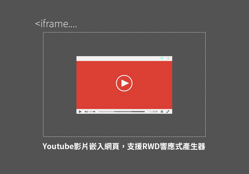
貼好後,立馬來預覽一下,影片會整個百分百的顯示到頁面中。

Step5
當切換成手機模式時,影片的寬度依然是100%,但高度則會自動縮放,真的超方便!完全無需透過javascript喔!
