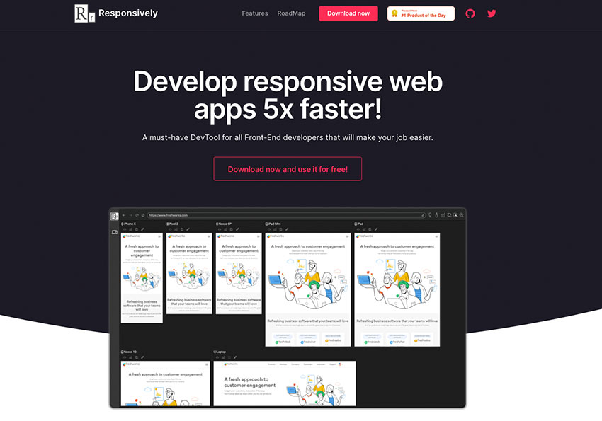
隨著現在智慧型手機,不斷的推陳出新,總不可能把所有的手機通通都給買回來進行測試,所以模擬器就相當的重要,因此今天梅干要來分享一個,相當棒的RWD檢測工具,不但可在一個頁面下,顯示網頁在各裝置的狀態外,甚至還可開啟網頁開發者人員工具與擷取功能,讓網頁在上線時,可以先作個全面性的檢測,因此身為網設的朋友,Responsively.app絕不容錯過,現在也一來看看囉!
Responsively.app
Step1
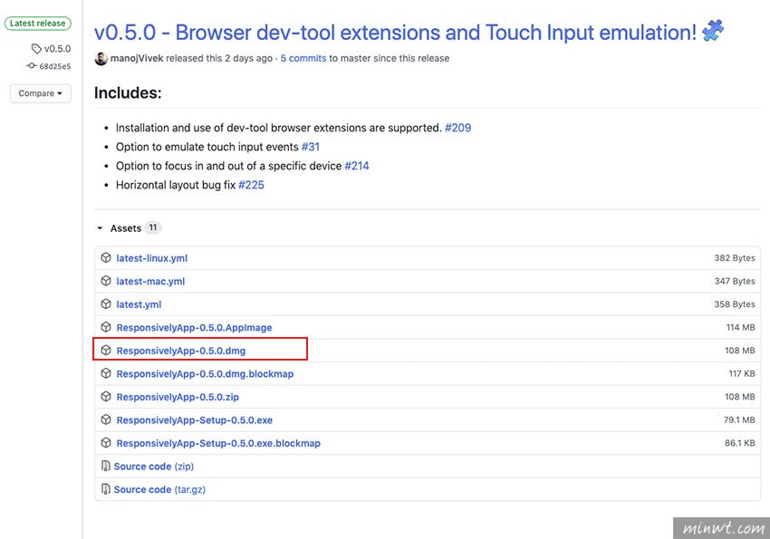
而Responsively.app將軟體放置在github上,除了支援Windows、Mac二大平台外,甚至還供原始檔,因此對於程式好手,也可下載原始檔,再自行進行擴充。
Step2
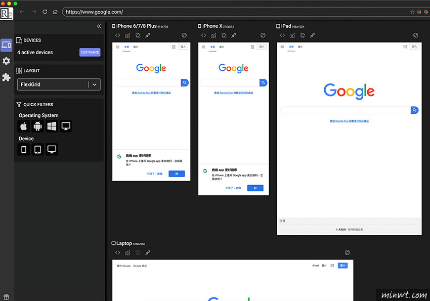
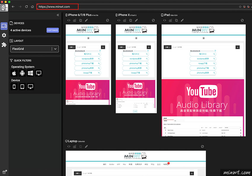
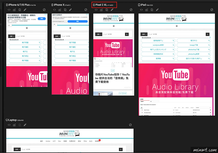
在安裝完畢後,開啟Responsively.app,分別就可看到,網頁在手機、平板、桌機版的顯示狀況。
Step3
接著只要輸入要檢測的網頁,下方的頁面,就會依各個裝置的解析度一一的呈現。
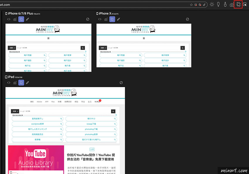
Step4
甚至右上上也有一些控制選項,當點了翻轉後,立即就可顯示,當橫向時,網頁版面的顯示效果為何。
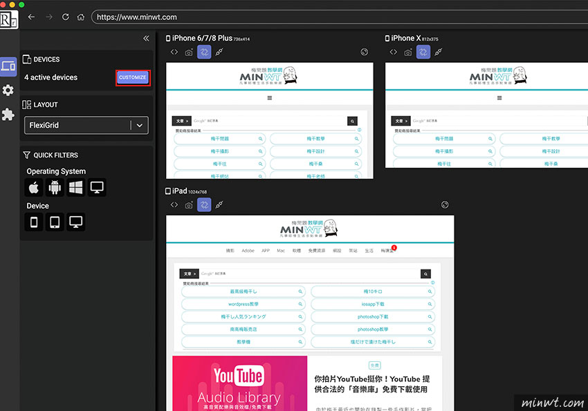
Step5
當預設裝置不足時,也可按右上鈕,進行擴充。
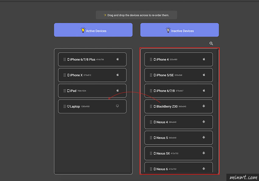
Step6
而右邊就是目前常用的裝置,接著只需將右邊的裝置選項,按住滑鼠不放,拖曳到左邊的區塊中即可。
Step7
當加入後,在網頁的預覽畫面,就會依照剛所新增的裝置一一的顯示。
Step8
甚至該工具還提供網頁開發人員工具,可選擇畫面的區塊元素。
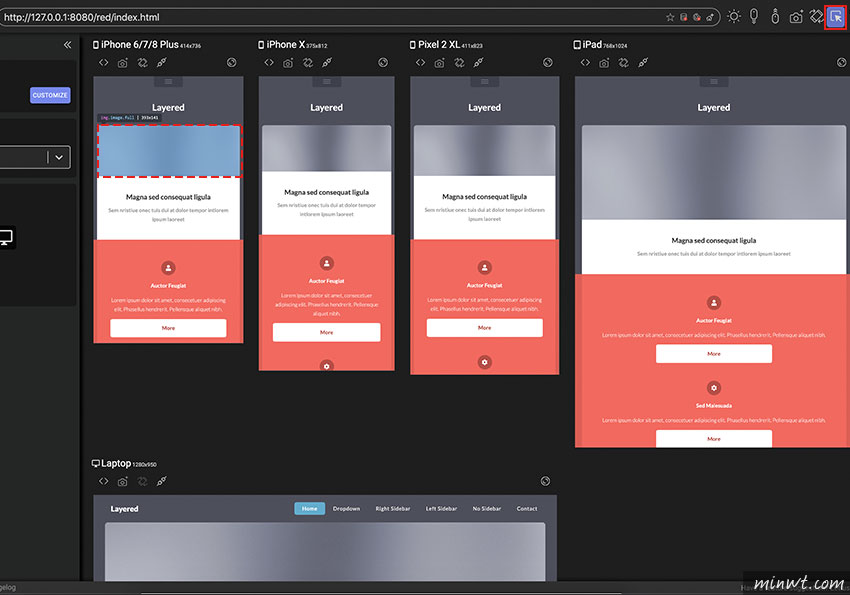
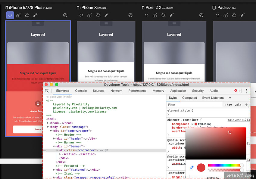
Step9
當選擇後,還會自動開啟開發人員工具面板,就可自行的修改CSS或是JS。
Step10
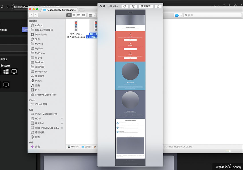
除此之外還有一個擷取工具。
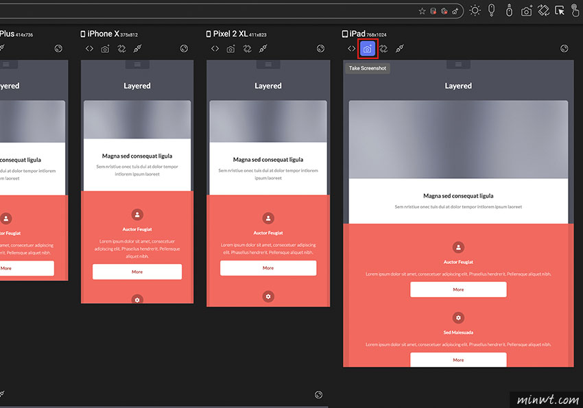
Step11
當一下後,立即就會將網頁全部擷取下來並儲存,如此一來無論是要跟客戶討論,還是與設計、程式人員連行溝通,都相當的方便,因此身為網頁設計的朋友,也趕快來下載囉!